Hand-e Learning: Digital Product Rebuild With an Emphasis on Users
Overhauling the User Interface and Targeting the Right Users
Problem Statement: Hand-e users were having trouble finding relevant surgical technique content. This was mainly due to an overwhelming amount of content (5,000 videos) and a muddy IA. This led to discontent and frustrations, as most users had a limited time frame to learn materials. How can Hand-e provide surgeons with the exact technical information they need?
Overview: Hand-e is a digital learning tool based around a large surgical video library. It’s main goal is to provide education to hand surgeons. It was once a member only benefit and behind a firewall but is now open to the public. My role was to provide research to our surgeon workgroup and develop design solutions based on their feedback for a new iteration of Hand-e; Hand-e 2.0.
Based off of the problem statement and overview, I began my focus on the following:
Curating the best content
Redefining the business goals and KPIs
Developing features to help with learning
User Personas
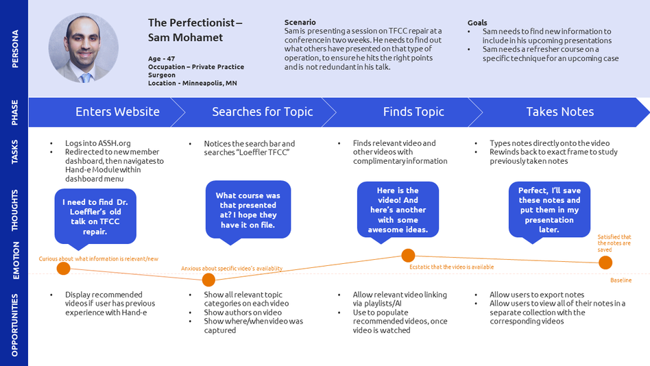
I had managed Hand-e for 3 years and had collected a variety of data from different sources. Using the findings I created the following personas.

These personas tackled Hand-e’s most frequent use cases: learning as a student, preparing content for a course/lecture, and preparing for an upcoming case.
User Journey Maps and User Flows
I built three main user journeys that correlate with the personas and use cases; one with the goal of accessing student learning materials, one for gathering materials for teaching a course/case, and one to gather and assess materials for lecture. Then I created three flows to fill in the gaps in the information architecture.

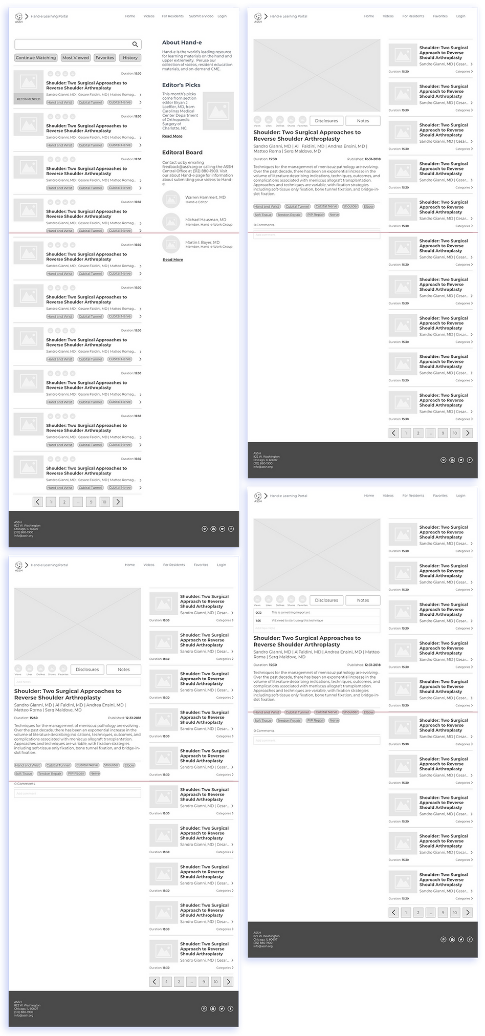
Low Fidelity Wireframes
Since hand-e received it’s own website and has a new business model, it gave me a lot of flexibility as to how I could build the new look and reorganize the content. I started with the homepage and built each feature from there.


User Testing Process and Results
Normally, I would go through a large and intensive user testing process at this point, but due to our niche user base and their busy schedules, I was limited to only 3 individuals for testing. I found the following issues.

Issue 1
Users can't easily find "How to Submit a Video"
Some users were having trouble easily identifying how to submit a video to the platform. I decided to remove the blurb about the editorial board. Although both these tasks are secondary for our users, video submission holds slightly more importance than our editor information.

Issue 2
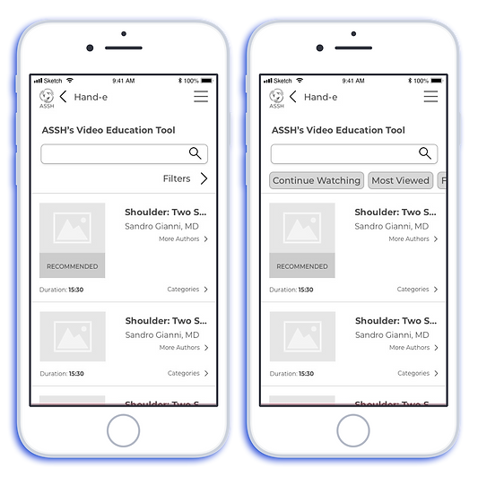
The video list filter was mistaken as a "Search" filter
One user believed that the filters string under search would generate all of our current search filters, while in reality that filter string was to help filter a user’s personalized video list (history, favorites, etc.) I removed the collapsed view and implemented a swipe gesture to ensure users can access all of their personalized lists. I may need to add some more spacing between both elements as well.
High Fidelity Mockups
I was able to create some high fidelity mockups after the testing process, which were then delivered to our stakeholders for approval. They followed our style guide and could be easily embedded into our bootstrap framework.

Follow Up and Key Takeaways
The main features and function will have to be tested more thoroughly for me to move onto the high fidelity mockups. Once complete with the mockups, we will go through another round of testing. Until I reach this point this project has taught me the following:
-
The importance of communicating with stakeholders. We had weekly meetings with our Hand-e workgroup to give them updates and get crucial feedback. This really helped in the content reorganization and design approval process
-
The diversity of our research data was crucial in curating the right content for the new Hand-e product. It allowed me to develop a more robust picture of our audience and align their goals to our offerings
-
Involving the development team early. Our development team normally takes the first step with our products but incorporating UX early on, helped distinguish potential roadblocks early on and led to a smoother process down the line


